As an independent insurance agent in the Senior Market you wear more than one hat. Not only do you have to understand the ins and outs of senior insurance, but you also have to promote your business. Let’s face it, if no one knows that you work in the Senior Insurance Market, then what’s the point of all your knowledge? That’s where marketing your business comes in!
One of the easiest and FREE ways to market your business is to utilize social media. Using Facebook, LinkedIn, Instagram, or even Twitter, you can let your followers (and potential clients) know what insurance services you provide and how you can help them. But how do you stand out from the other posts on social media?
One answer is visual content! So today I want to focus on the visual content you can create to improve your social media posts.
[divider scroll_text=””]
But first, can you humor me for a second? Scroll through your Facebook newsfeed (I’m sure you have one!) and notice what content captures your attention.
If you’re like me, you tend to stop and read posts that include pictures or have a colorful background with large text that stands out. And it’s not just us! Studies have shown that posts with images produce better engagement and increase user interaction by 39%! And what you can also consider is that according to Kissmetrics, PHOTOS get 53% more likes, 104% more comments and 84% more click-through on links than text-based postsⁱ. This means your posts on Facebook (or whatever other social media outlets you use) will need to stand out visually to draw attention to the information that is pertinent to your potential clients.
Let’s compare 3 examples of the same post for Facebook…
Here’s our 1st example:
Pretty boring, huh? This is just a post on Facebook, but our message will get lost with the other content in our client’s newsfeed. To make this post stand out a bit more we’re going to use the same wording to design a post that better catches the eye.
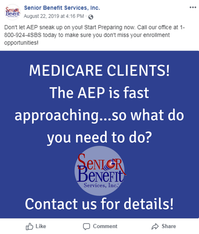
Here’s our 2nd example:
Notice that by using an image we can get across two messages to our potential clients in one post:
- Our message (what you’re saying)
- Our call to action (what you want your client to do)
The picture draws the attention of our potential client and the message above gives our call to action. Now, this post is a step in the right direction with the added color and text that nicely contrasts the blue background. However, the words sort of blend together in the layout, and our Senior Benefit Services logo is also difficult to see in the light blue circle. Instead, we’ll improve this post by adding another color, changing the font, and placing the text differently. We also want to highlight the logo with a better background color.
Here’s our 3rd example:
The new design has the same wording, but changing the placement and font style for the words, “MEDICARE CLIENTS!” draws your attention to what else this post has to say. We changed the color of “THE AEP IS FAST APPROACHING.” and centered the text. The next text, “SO WHAT DO YOU NEED TO DO?” is white to bring some balance to the post. As you can see the post is designed to be yellow, white, yellow, white and continues in that AB pattern. Adding the light bulb symbolizes an idea or knowledge so we made sure to add that icon above “CONTACT US FOR DETAILS.” It’s these little changes that can really make your post stand out in a busy newsfeed to grab the attention of the potential clients you’re looking for. Use this in combination with the call to action message above it and clients are more likely to see and react to your post.
I know what you’re thinking,
“This post looks great! (awww thanks!) but I’m an insurance agent, not a Graphic Designer or Marketer. I can’t make anything like this.”
Well actually it’s a lot easier than you’d think! Keep reading and I’ll reveal my secret as to how I created these images and how you can too.
[divider scroll_text=””]
We suggest you use Canva for your social media visual content posting needs. The reason is it’s simple and it’s FREE! But if you want one more reason, Canva provides you thousands of layout options for all social media types so your posts look professional every time. Did you really think I just randomly created the Facebook post example above?? Nope! I just replaced the words with what I wanted to say and added our logo (told you I’d reveal my secrets!). With Canva, they supply you with a library of free images but you can also upload your own images like your company logo, or even your own photo if you want to give your posts a more personal touch.
This is a great way to immediately boost your social media presence and engagement, But visual marketing is more than just a colorful post on social media. And honestly I would tell you more, but I can’t give away all my secrets… but for our Producing Partners I will!
At Senior Benefit Services we are Helping You Succeed in the Senior Insurance Market. We do this by providing our Producing Partners with more content, not just in the Senior Market but how to market their business as well.
Contact the Marketing Department today for more information on how we can help you succeed in the senior insurance market.
ⁱCorliss, Rebecca. “Photos on Facebook Generate 53% More Likes Than the Average Post.” HubSpot Blog, 27 Aug. 2017, blog.hubspot.com/blog/tabid/6307/bid/33800/photos-on-facebook-generate-53-more-likes-than-the-average-post-new-data.aspx.
Other Cool Sources I Referenced:
https://www.thesocialmediahat.com/article/do-images-really-make-best-facebook-posts
https://learn.g2.com/visual-content-marketing
https://rismedia.com/2019/07/29/lead-gen-social-media-marketing/#close


